Why Readers Flee Before Your Story Even Begins
In digital publishing, every typographic decision carries weight. A visitor may arrive through search, social media, or a shared link with genuine interest, yet leave before reading the opening paragraph if the page offers no clear visual invitation. Screens encourage rapid judgment. Readers scan for relevance, effort, and reward before committing attention, often deciding within seconds whether a page feels approachable or exhausting.
Typographic hierarchy is the invisible cognitive roadmap that determines what the eye notices first, what it understands next, and where it can pause without losing direction. Font size, heading structure, line length, spacing, contrast, and emphasis work together as a spatial interface. Strong web design standards make that interface predictable across devices. The result is not decoration. It is a deliberate interruption to impulsive bounce behavior, giving casual visitors immediate entry points and enough confidence to continue.
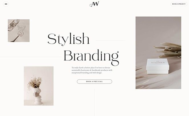
Decoding Modern Scanning Behaviors and Eye Movements
Most online visitors do not begin with commitment reading. They first inspect the page for signals that answer three practical questions: Is this relevant, can the information be understood quickly, and is the effort likely to be worthwhile? Eye-tracking research from the Nielsen Norman Group describes the familiar F-shaped pattern, in which attention concentrates near the top of the content area, moves across an initial line, then becomes shorter before tracking down the left side.
The F pattern is not a universal law, and it should not be treated as a design target. It often appears when users are motivated by efficiency, the content is weakly formatted, or the page does not provide strong reasons to read every word. Other patterns include spotted scanning, in which distinctive terms attract attention, and layer-cake scanning, in which readers move between headings and the paragraphs beneath them. Layer-cake scanning is especially valuable for publishers because it shows how meaningful subheadings can convert a skim into selective, purposeful reading.
Readers scan because scanning can produce much of the information they need with less time and cognitive effort than line-by-line reading. A dense paragraph forces the eye to make its own map. A structured page provides one. Use headings and visual anchors to create a rhythm that repeatedly brings attention back into the body copy.
- Write subheadings that communicate the point of the section, not merely its topic.
- Place the most important idea near the beginning of paragraphs and list items.
- Use bold emphasis sparingly to identify terms, benefits, or decisions that matter.
- Break complex explanations into short sections with visible relationships.
- Reserve decorative elements for moments when they clarify structure or reinforce meaning.
Eye movement is guided by contrast and expectation. If every element has equal size, weight, and color, nothing establishes priority. If too many elements compete, attention fragments. Deliberate anchors allow the eye to skim efficiently while preserving a path toward deeper reading. This is the difference between a page that merely contains information and one that helps readers navigate it.
Calibrating the Line Length Threshold for Frictionless Flow
Line length is one of the quietest causes of reading friction. Body text that stretches across a large desktop viewport can appear efficient because it uses available space, but wide lines increase the distance the eye must travel and make the return sweep to the next line less reliable. The reader may lose the correct starting point, reread a line, or abandon the passage altogether. Research and testing summarized by Baymard”s readability guidance identify approximately 50 to 75 characters per line as a strong target for comfortable body text, while accessibility guidance commonly permits up to 80.
Short lines create a different problem. Excessively narrow columns force frequent horizontal movement and can interrupt the natural cadence of reading. Responsive typography therefore requires calibration rather than rigid obedience to a single number. Font size, column width, margins, and vertical leading must be considered as one system. A measure near 70ch can work well for many typefaces, but the same value will not look identical in every font or at every viewport width. A precise visual rhythm begins when teams refine their core web design standards to maintain comfortable eye movement across devices.
| Typography Variable | Practical Direction | Reader Benefit |
|---|---|---|
| Line length | Start near 50 to 75 characters per line | More reliable line returns |
| Line height | Use roughly 1.5 times the font size as a starting point | Clear separation without visual isolation |
| Paragraph spacing | Make paragraph breaks visibly distinct | Faster content grouping during scans |
| Mobile measure | Prioritize readable type over preserving desktop width | Less squinting and fewer accidental skips |
Line height is equally important. Tight leading compresses the page and makes adjacent lines compete, while excessive leading weakens the connection between sentences. A balanced leading value gives each line enough air to remain distinct while keeping the paragraph visually cohesive. Designers should test actual editorial content, including headings, links, lists, quotations, and long words, rather than judging a system with placeholder text.
The Mathematics of Typographic Scale and Visual Weight
A typographic scale gives a page a measurable hierarchy. Instead of selecting heading sizes independently, designers can establish a ratio between body text, introductory text, subheadings, and the primary headline. A modest scale might move from 1rem body text to 1.25rem for supporting headings, 1.6rem for major sections, and 2.4rem or more for a page title, with values adjusted for the typeface and viewport. The ratio matters less than the consistency. Readers learn the visual grammar quickly, then use it to predict where ideas begin and how they relate.
Size alone does not establish priority. Optical contrast depends on weight, color, whitespace, alignment, and placement. A large heading with weak contrast may recede, while a smaller heading with strong weight and generous surrounding space may command attention. The principles described in Material Design”s type system are useful as a starting framework, although any system must be tested with the chosen font, language, and content density.
Hierarchy should serve the narrative rather than overpower it. A skimmer should be able to understand the article”s central argument by reading the title, subheadings, emphasized phrases, and perhaps the first sentence of each section. That does not mean revealing every detail in the headings. It means making the content”s architecture legible within seconds.
- Use one clearly dominant page title to establish the subject and promise.
- Give major sections a consistent heading level and visual treatment.
- Use body text as the stable baseline against which all other sizes are judged.
- Apply bold weight to meaningful phrases, not entire paragraphs.
- Use whitespace to separate conceptual groups before adding more color or ornament.
Proportional margins also carry meaning. More space before a major heading signals a new chapter. Less space between a heading and its opening paragraph signals that the two belong together. This spacing logic helps readers construct a mental model of the page. In that sense, whitespace is not empty. It is connective tissue.
Connecting Reader Comfort to Search Visibility and Conversions
Typography does not function as a direct search ranking switch, and dwell time should not be treated as a guaranteed ranking factor in isolation. Yet readable structure affects the behaviors that shape digital performance: whether visitors continue, explore related pages, understand an offer, or complete an action. Clear hierarchy makes content easier to interpret for people and more coherent for systems that process semantic headings, links, and page relationships.
Conversion paths also benefit from cognitive clarity. A visitor who can quickly identify the problem, the proposed solution, evidence, and next step faces less decision friction. Typography gives each stage an appropriate visual role. One primary call to action should not compete with a dozen equally emphatic links. Outcome-focused headings, short explanatory blocks, trust signals, and accessible contrast create a sequence that feels navigable rather than coercive.
- Review the page at mobile and desktop widths, looking first at the title, headings, and call to action.
- Check whether a skim of headings alone communicates the article”s central narrative.
- Measure body-text lines and narrow overly wide columns before reducing font size.
- Inspect contrast, focus states, link visibility, and text scaling for accessibility.
- Compare engagement metrics by template, then validate assumptions with usability testing or controlled experiments.
Performance belongs in the same audit. A beautiful hierarchy cannot compensate for a slow page, unstable layout, or intrusive interface. Page speed, mobile responsiveness, CTA clarity, visual grouping, and credible social proof compound their effects. Examine scroll depth, engaged sessions, return visits, internal-link clicks, and conversion completion together. A low bounce rate is not automatically success if visitors cannot find the intended action, and high time on page may reflect confusion rather than interest.
Transform Your Editorial Layout into an Intuitive Sanctuary
Typographic hierarchy is functional engineering. It bridges casual interest and meaningful engagement by reducing the number of decisions a reader must make before understanding the page. The strongest layouts do not demand attention through noise. They earn it through order. A clear scale, controlled measure, dependable spacing, and visible section logic protect cognitive energy while allowing the content itself to carry authority.
Start with the adjustments that produce the clearest gains. Limit body-text width, strengthen the difference between heading levels, increase paragraph separation, and rewrite vague subheadings into useful promises. Then test the page on a small screen, where weak hierarchy becomes impossible to hide. Track how readers move, where they stop, and whether the next action is obvious. When every typographic choice supports the reader”s path, a publication becomes easier to enter, easier to trust, and far more likely to hold attention beyond the first glance.